 iCE!
iCE!Designed for 2560x1440 but will scale to any resolution with JG AutoScale. Please note this may cause some elements to appear differently than the creator intended.
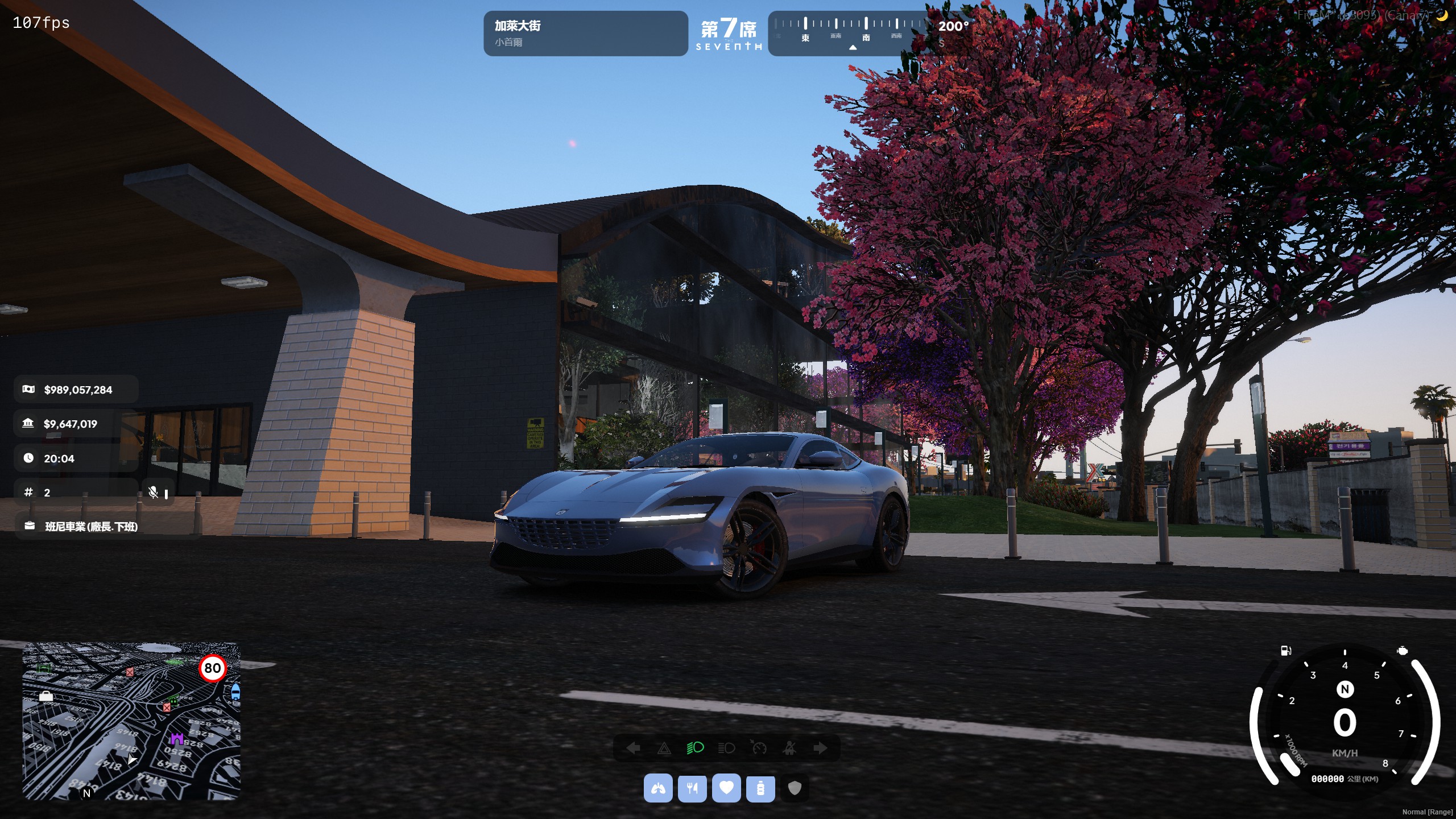
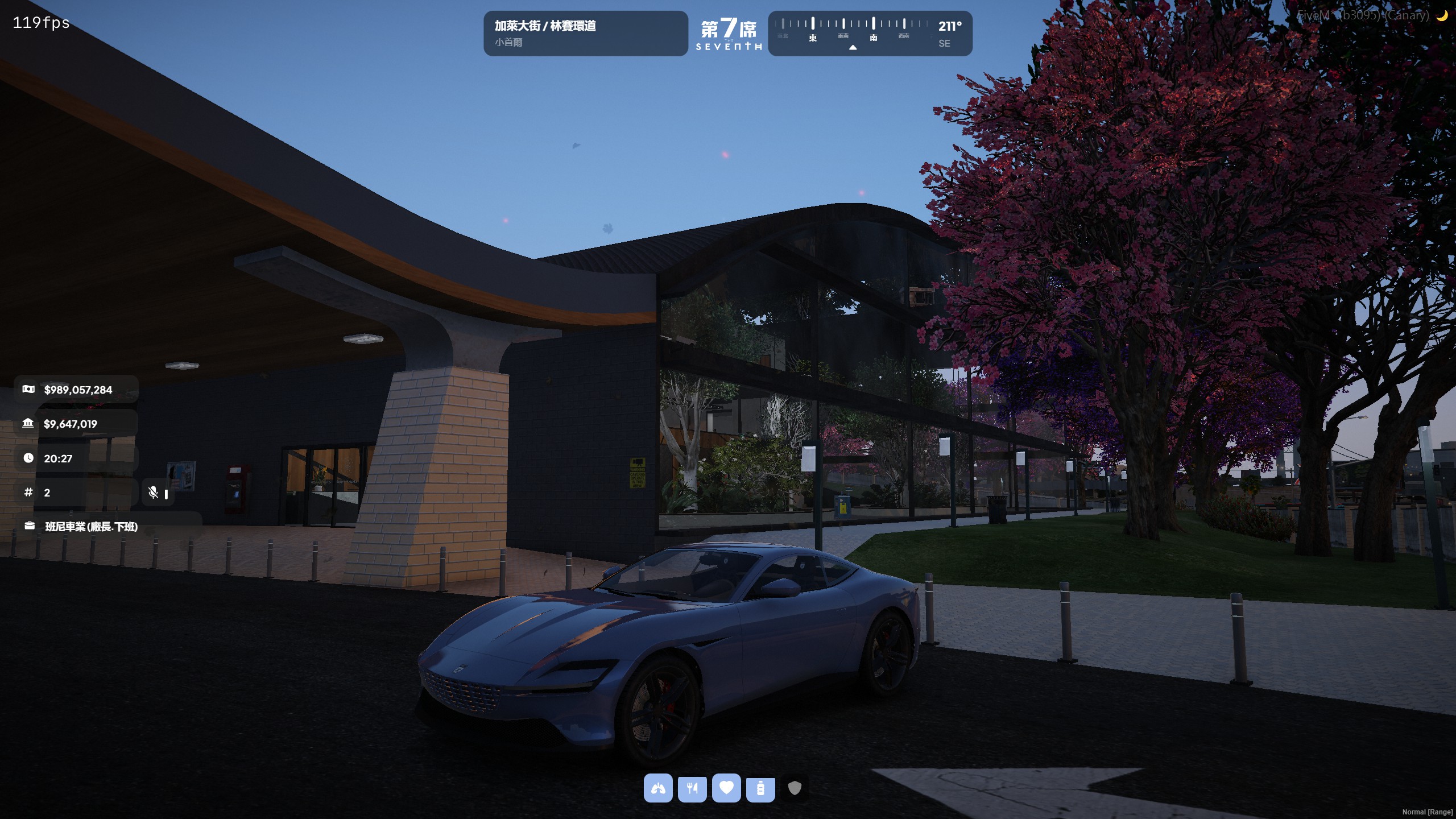
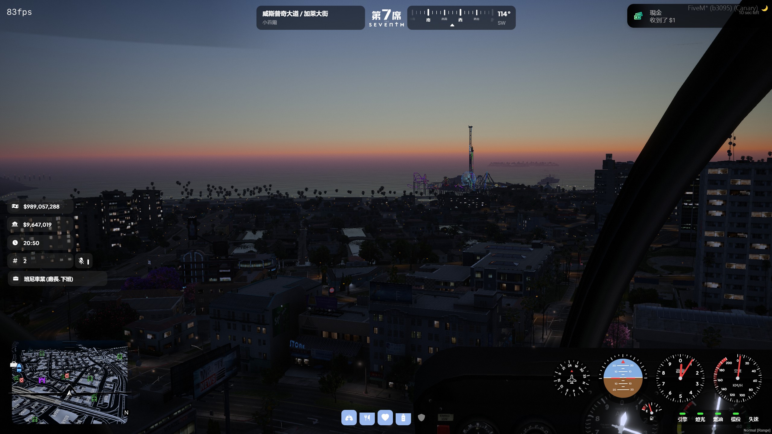
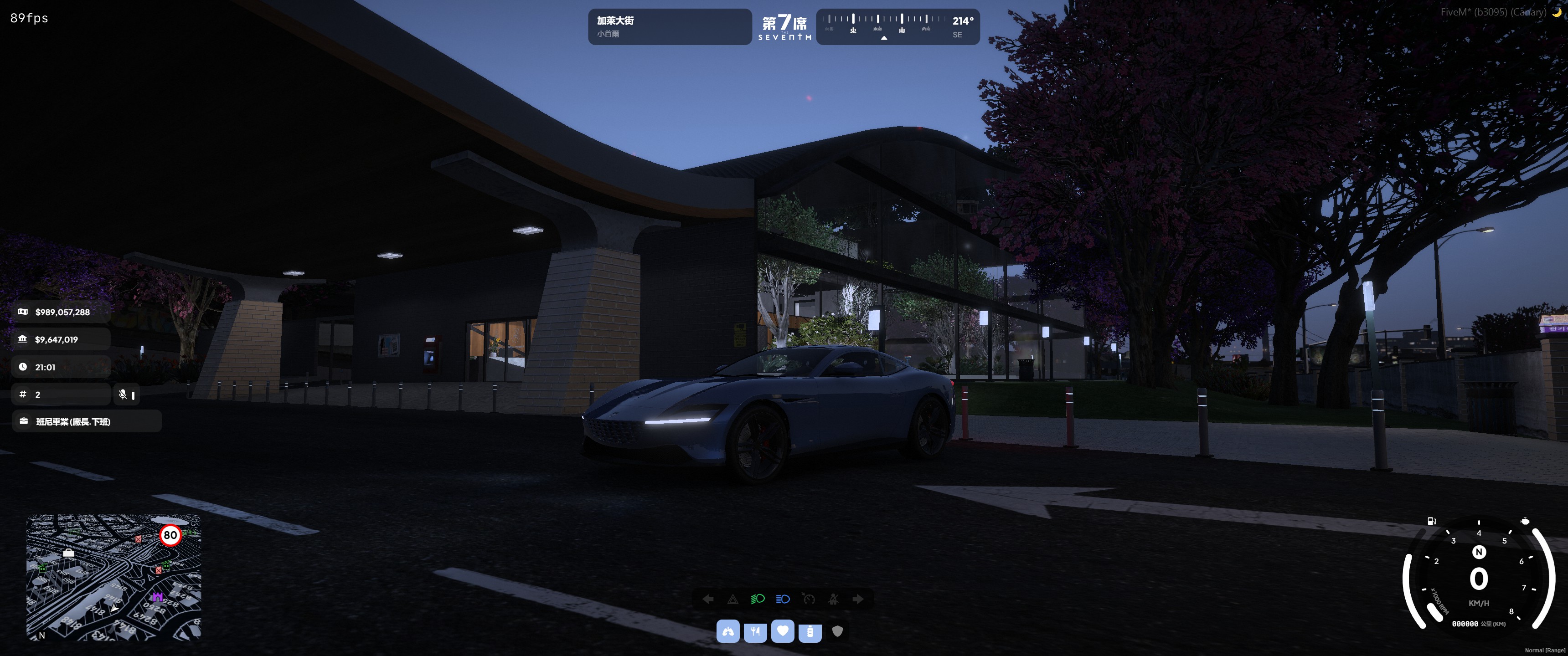
I always like the looks of my status at the middle of the screen because I like the look of everything being properly align and centered. it feels neat and comfortable to look at. I've also made the job money tab to have uniform looks, the reason why the job bar is bigger than the other thing is one, some of the jobs in my server has some insanely long name, this is the right length to fit in without having ... behind the job name, two, it will provide a space just right for the mic logo to sit. Lastly ive moved the compass and street name to the top, with my server logo at the middle. The top left space is reserved for chat box, and the top right space is reserved for notify, which also has a very clean look you can see in the third pic. pic1: 16:9 vehicle view pic2: 16:9 on foot view pic3: 16:9 on heli view with notify pop out pic4: ultrawide view where I designed the hud to use with.
Uploaded